

DESCRIPTION
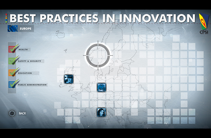
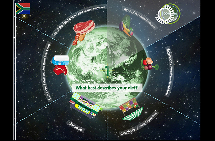
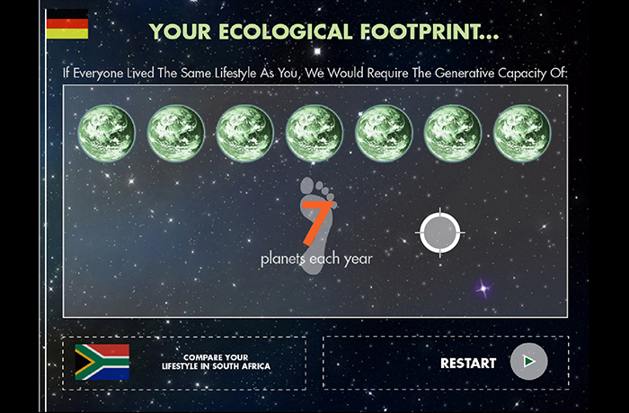
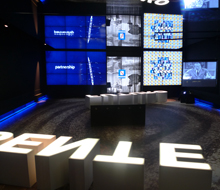
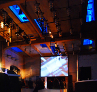
For the Centre for Public Service Innovation (CPSI) near Pretoria, South Africa we created several user interfaces for a tracking device developed by HHI Fraunhofer in Berlin, the iPoint.
The device accurately tracks one or multiple finger gestures, which can then be calibrated to navigate a Graphical User Interface. We developed two applications for this system for an educational exhibition environment, one information kiosk with best practise examples of innovation in public service, one assessment of the users’ understanding of innovation principles.
Challenges with the conceptual model of the interaction
Although pointing surely is one of the most archaic gestures as it can already be observed in small infants, user presented with a screen and the invitation to point at it behave all but “natural”. Even when instructed to point at the screen “naturally” many users bent their arms in anticipation of triggering a sensor in the black box above or underneath them.
It seems “unnatural” to users to interact with a screen by pointing at it. Thus, the gesture itself needed to be instructed and could only be applied after reflection in the new context
The trigger problem:
Most computer interfaces separate pointer and input action. This gives users a chance to reflect on their choice before executing an action. A gesture based point interface does not have a mouse click, so an alternative way of selecting an action had to be invented.
Thus, for our South African client, we looked at GUI solution that did away with clicking and worked solely with roll-over like the website experiment Don’t click it.
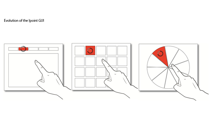
Our first iPoint GUI was a structure of unfolding and collapsing content display areas which open and close according to the position of the cursor. However, what seemed a viable solutions for a Desktop computer interface with a mouse pointer, did not work as a finger pointing device. After selecting content, users had to leave their arm in the same position as long they needed to absorb the content, which caused great discomfort for our users. A subsequent version was designed in a way that users could lower their arm without triggering other content areas. But even this solution resulted in many accidental selections. The current design comprises of a time-delayed activation, a visual countdown, which activates a link only if a user remains in one position for a few seconds. A similar solution is featured in Microsoft Kinect games.
Pointing Ergonomics
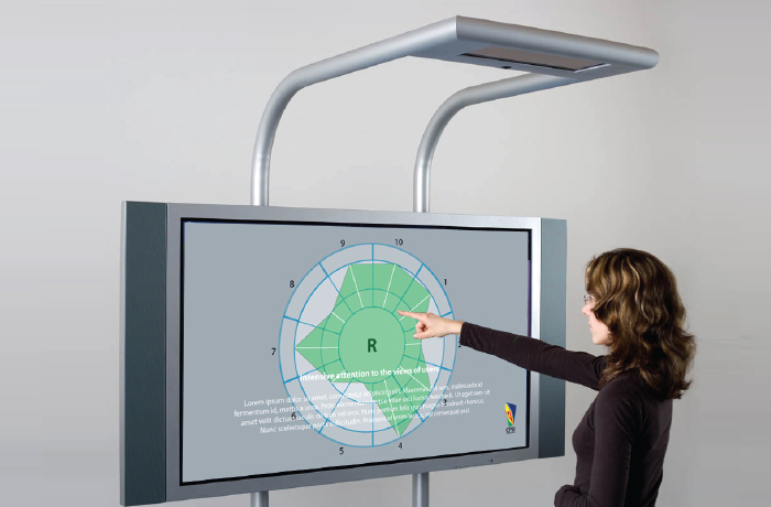
Even with the time-delayed activation functionality we still faced ergonomic problems. It was uncomfortable and tiring to navigate the interface even if just for a few minutes at a time. We realised that we had spent a lot of time thinking about trigger mechanisms, but had not yet looked closely at the specific ergonomics of pointing with hand and arm. After a few tests we found that although user managed to navigate traditional GUI’s with a horizontal menu structure, keeping arm and hand on a small target for the necessary 2 seconds until the link activated added a fair amount of discomfort. The second generation of tests was conducted with a checker board interface, which not only offered larger hit areas, but also used the entire screen space as the interactive area. This made the interaction more fluid and users felt more in control. However, at the same time, the absence of a resting area pressured users to make a quick selection, which made the interaction uneasy. The current interface and best solution to date is a circular GUI , which follows the natural ergonomics for pointing with the hand, since it supports the circular movement of the wrist. The movements feel natural. At the same time movements can be reduced to an absolute minimum; the interface can be navigated with only the index finger moving. With regard to the trigger area, we found that adding large interactive areas and roll-over states added to the experience of control and ease, whilst the trigger areas or buttons needed to be separated from the active areas, so the trigger timer would only be activated if users intended to do so.
extract from:
IFIP INTERACT 2013 Lessons Learned from Designing Non-traditional Interfaces for Educational Applications in South Africa Michael Wolf CEO & Interaction Designer at Formula D interactive, Cape Town
TEAM
Michael Wolf ,Ivan Pecorari, Scott Chapman
iPoint, Touchless controll and interface
- Categories →
- Interaction Design
- User Experience
Portfolio
-

iPoint, Touchless controll and interface

-
Learning is a Breeze – Formula D Interactive
-
Remix Remake Remodel
-
CRYSTAL – Daan Roosegaarde
-
Eni Exhibition for 150 years of Italy’s Unification
-

il cielo stellato sopra di noi
-

I Blush Sometime
-
Videogiocando
-
ON -GOIN MEET MEDIA GURU PLATFORM
-
TACTILE TRACE
-
Fishing Game
-
Family
-
Shadow Playground
-
Diario Gerra
-
Revolt Eternaluce
-
Radura Visionaria
-

Recycled Chairs
-
Toddler and infant School in Prato
-
Camera Obscura
-
Interiora
-
A-settico
-
Atelier 7 Soglia + Cluster Box